Leaf File Upload Link
Overview
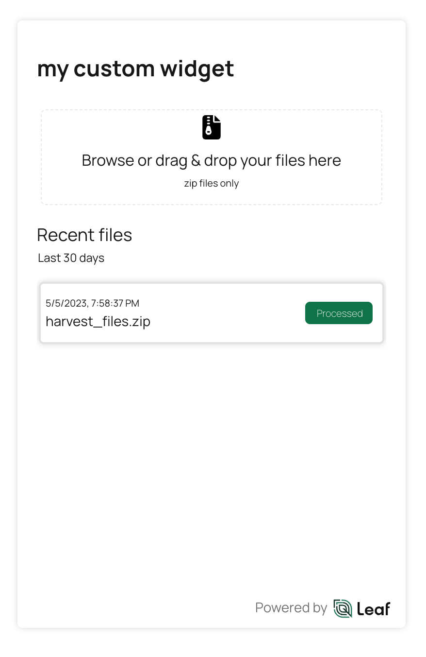
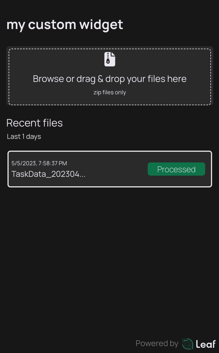
Leaf's File Upload Link is a widget that allows your customers to upload different machine file formats. These files will then get converted into a consistent output using the Leaf API.
Beta
This is a beta feature.
How it works
The user can add files using the file picker from the Browse button or drop files in the Drag & drop zone. Your files must be in a zip file.
During the upload, the users can see the progress of the upload and they are able to cancel the upload process for the pending files.
Requirements
In addition to being authenticated, you must have at least one Leaf user created. Learn more here.
Get started
1. Sign in with a Leaf account
You will need a Leaf account. If you don't have one yet, you can create it here.
2. Get an access token
To use the widget you will need a Leaf token. Use our authentication guide to know how it works.
Tutorial
Angular
tip
Here you can run a live use case demo! It will only be necessary to replace your information in the .html component.
To add this Leaf widget in an Angular application, you can use the @withleaf/leaf-link-angular library, which is a JavaScript library that provides all Leaf UI Widgets.
Here are the general steps to get started:
- Install the @withleaf/leaf-link-angular package using
npm:
- Import the library in your component or module file:
- Add the component to the HTML. Make sure you already created the Leaf user API key (
apiKey); you need to specify both the Leaf User API Key and the Leaf User ID (leafUser) in the required properties in the HTML component. Check all the properties available on the reference here.
React
tip
Here you can run a live use case demo! It will only be necessary to replace your information in the App.tsx file.
To add this Leaf widget in a React application, you can use the @withleaf/leaf-link-react library, which is a JavaScript library that provides all Leaf UI Widgets.
Here are the general steps to get started:
- Install the @withleaf.io/leaf-link-react package using
npm:
- Import the component in your
*.tsxfile:
- Add the component to the
*.tsxfile. Make sure you already created the Leaf user API key (apiKey); you need to specify both the Leaf User API Key and the Leaf User ID (leafUser) in the required properties in the tsx component. Check all the properties available on the reference here.
Reference
It is valid only for the React version.
Property Overview
| Name | Type | Summary |
|---|---|---|
| apiKey | String | The authentication API Key |
| companyLogoUrl | String | Customization: a link to the company logo |
| companyName | String | Customization: the name of the company |
| filesTimeRange | Number | Time to get the historical of uploaded files |
| isDarkMode | Boolean | Enables/disables the dark mode |
| leafUser | String | The Leaf User ID |
| locale | String | Forces the widget language |
| title | String | Customization: a link to the company logo |
Property Details
apiKey
The apiKey is the authentication key that will allow the use of the widget.
It can be created and managed here.
companyLogoUrl
The URL to the company logo. It will be displayed in the landing screen. It can be a PNG, JPEG or SVG.
companyName
The company name. It will be displayed in the landing screen and in each reference about the customer.
filesTimeRange
It sets the interval in days to display files already processed in the past. For example, if set to 30, it will display the list of files sent and processed in the last 30 days.
isDarkMode
If set to true, it will enable the widget dark mode.
leafUser
The Leaf User ID. Check this page for more info about the Leaf User.
locale
By default, the widget sets the language based on the user's browser configuration, but to force a language, use this property with one of the possible values: en_US, pt_BR, es_ES, or fr_FR.
title
The text to display on the top of the widget.
Hooks Overview
Leaf Link also have hooks that can improve the developer experience when using the widgets.
| Name | Type | Description |
|---|---|---|
| leafBatchIds | Array<{ batchId: string }> | Provide the array with the batchId of the uploaded files |
Hooks Details
leafBatchIds
Provides the array with the batchId for each uploaded file. A new ID is added after each successful upload.
How to use it
Angular
Use the getLeafBatchData property to reference a function in your component.
From the component, you can get the leafBatchIds array in the referenced function.
React
In the index.tsx will be necessary import the component Leaf.
And this component should be organized like this:
Additionally, you will need to import the useLeaf function as well:
So will be necessary adjust the function in the App.tsx file:
In this example we use the useMemo but you can use another hooks.